Till now we have seen the difference between Fundamental and Technical Analysis and some of the indicators used in technical analysis. In this post, we are going to learn about historical patterns that traders and investors use and that everyone should know.
Technical Patterns
So first of all what are technical patterns?
Technical Patterns are distinctive formations created by the movements of security prices on a chart and serve as the foundation of technical analysis. Technical patterns can be seen at a macro level as well as at a micro level, that is we can study the Chart patterns or candlestick patterns. If you don’t know what these two are don’t be worried, this is what we are going to discuss in this post.
Let’s start with Candlestick Patterns.
What are Candlestick Patterns?
Candlestick patterns depict daily price movements on a candlestick chart. These charts show the price movement of derivatives, securities, and currencies as visual patterns. Understanding candlestick patterns allows you to gauge market sentiment and make informed trading decisions.
Components of a Candlestick:
The Candlestick has two components as mentioned below:
- Real Body: The wide part represents the price range between the day’s open and close. A filled red real body means the close was lower than the open, while a green real body means the close was higher than the open.
- Shadow (Wicks): Vertical lines above and below the real body show high and low prices.
Refer to the below image for more clarity on how a candlestick looks.
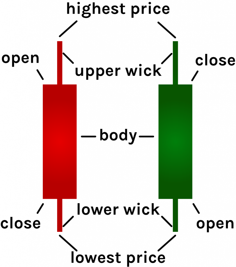
Pic Credit – phemex.com
Candlestick Patterns:
Like Macro patterns, candlesticks also form different patterns. Some of them are listed below:
Hammer:
It is a bullish reversal pattern. The hammer appears during a downtrend when sellers initially dominate the market signaling a potential price reversal to the upside, which in turn indicates that the market is trying to find a bottom. It is characterized by:
- A small real body (the difference between opening and closing prices).
- A long lower wick (shadow) that’s at least twice the size of the real body.
- The candlestick’s upper end resembles a “T.”
The T can be interpreted as the bears trying to pull the price down but not being successful due to the bulls gaining the upper hand. A hammer candlestick doesn’t signal a reversal until it’s confirmed. To confirm for reversal look for the following in the pattern the next candle after the hammer should close above the hammer’s closing price.
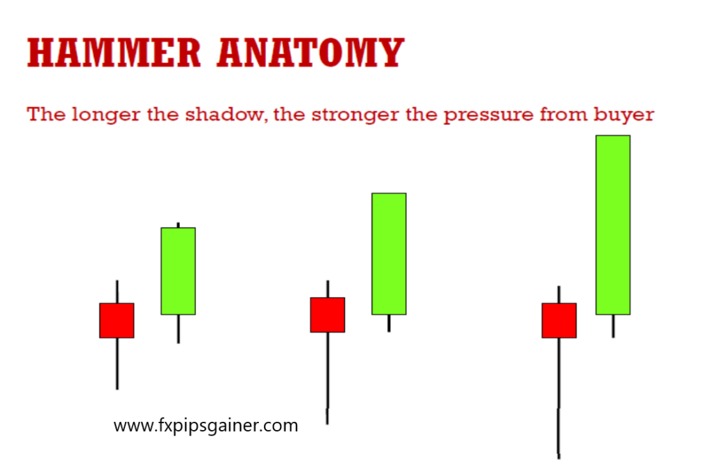
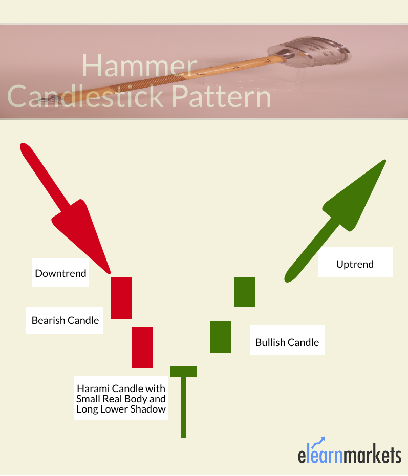
Ideally, this confirmation candle shows strong buying. Traders may enter long positions or exit short positions during or after the confirmation candle. Set a stop loss below the low of the hammer’s shadow.
An important thing to note is that there is a similar pattern that appears at the top of an uptrend known as the Hanging Man signalling a trend reversal.
Inverted Hammer:
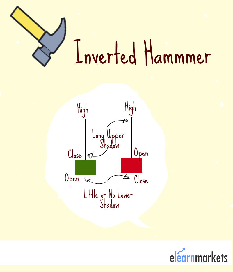
It is similar to the hammer but appears after a downtrend. It signals a potential bullish reversal. The inverted hammer appears mainly at the bottom of downtrends. It is characterized by:
- A small real body (open, low, and close roughly the same price).
- A long upper shadow (at least twice the length of the real body).
- Little to no lower shadow.
The inverted hammer signals a potential bullish reversal. It suggests that sellers hesitated to push prices lower during the day. Bulls test the bears’ power, potentially leading to an upward move.
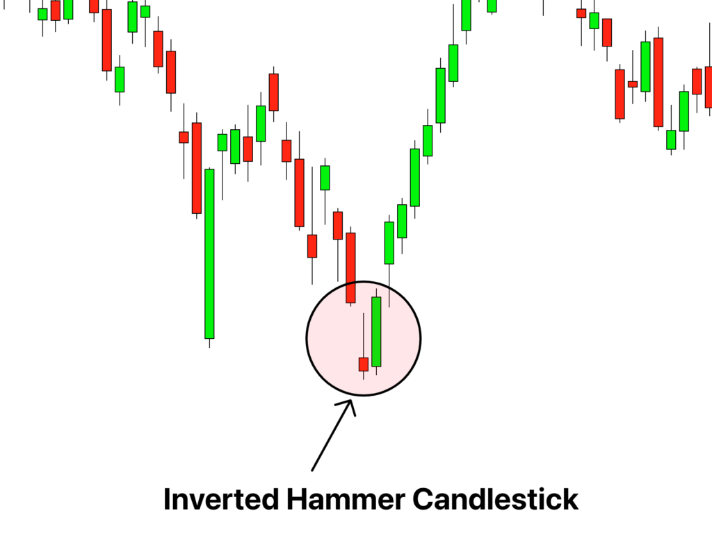
Look for a bullish confirmation candlestick after the inverted hammer. Other indicators (like trendline breaks) can enhance the signal. Remember, the inverted hammer warns of a price change, not a standalone buy signal.
A similar pattern is the shooting star which appears at the top of an uptrend indicating a potential trend reversal. It is usually red in color.
Bullish Engulfing:
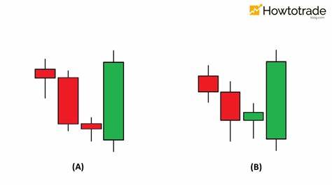
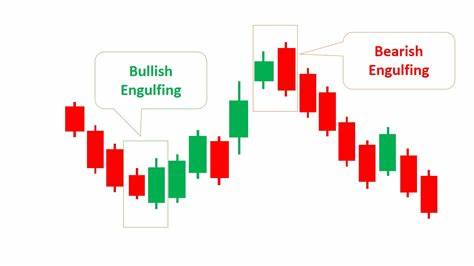
It is a two-candle pattern where the second candle completely engulfs the first, suggesting bullish momentum.
A bullish engulfing pattern occurs when a small red candlestick (indicating a stock closed lower than its open) is followed by a large green candlestick (indicating a stock closed higher than its open).
- The second candle completely engulfs the real body of the first one, regardless of tail shadows.
- It appears in a downtrend and consists of one red candle followed by a larger hollow candle.
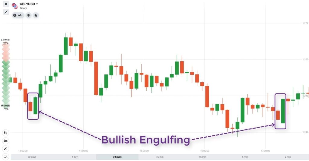
On the second day, the price opens lower than the previous low but eventually rises higher than the previous high, favoring buyers. Traders can enter a long position when the price surpasses the high of the second engulfing candle, confirming the downtrend reversal.
Remember, a bullish engulfing pattern represents a day where bears initially controlled the price but bulls decisively took over by day’s end.
Bearish Engulfing:
The opposite of bullish engulfing is a Bearish engulfing pattern indicating a potential bearish reversal.
The bearish engulfing pattern is a chart pattern in technical analysis that signals a reversal in an upward price trend.
Here are the key characteristics:
- Comprises two consecutive candles.
- First candle: Smaller, bullish (green or white).
- Second candle: Larger, bearish (red or black), engulfs the first candle.
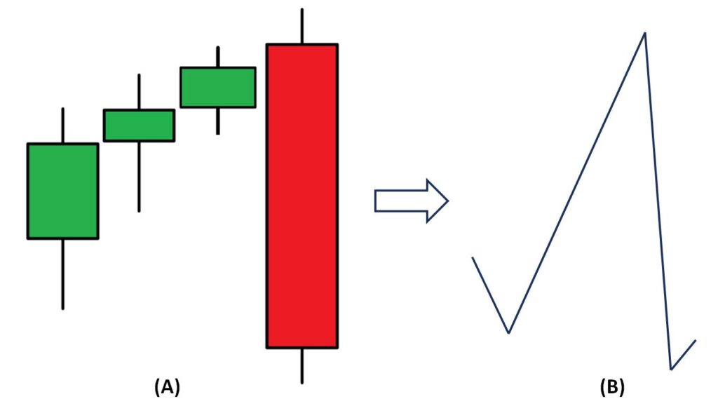
It indicates a shift in market sentiment from buyers to sellers, suggesting weakening bullish momentum after an uptrend. It is often an early indicator of a downtrend.
Traders use it as a signal to initiate short positions. Set a stop loss just above the high of the engulfing candle. Combine with other indicators like RSI, MACD, and volume for better accuracy.
Doji:
It consists of a single candle with the real body being very small. Signals indecision, meaning the buyers and sellers can’t decide the direction, the stock mostly trades sidewards. A doji candlestick pattern occurs when the opening price and closing price of a security are equal or very close. It is formed due to the price initially being high, then pulled down by bears.
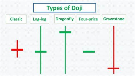
There are different types of Doji as described below:
- Gravestone Doji: Open, high, and close are at the low of the session.
- Long-Legged Doji: Long upper and lower shadows, equal open/close.
- Dragonfly Doji: Open, low, and close are at the high of the session.
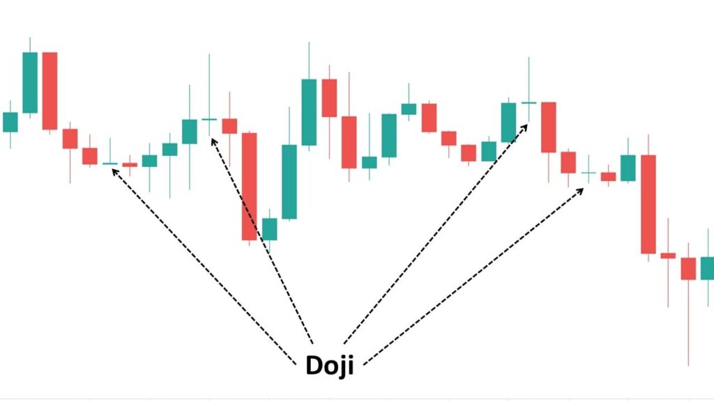
Doji rarely signals a trend reversal and as with other patterns doji doesn’t provide much information alone, it has to be combined with volume, trendlines, or moving averages for better insights.
Candlestick vs bar Charts:
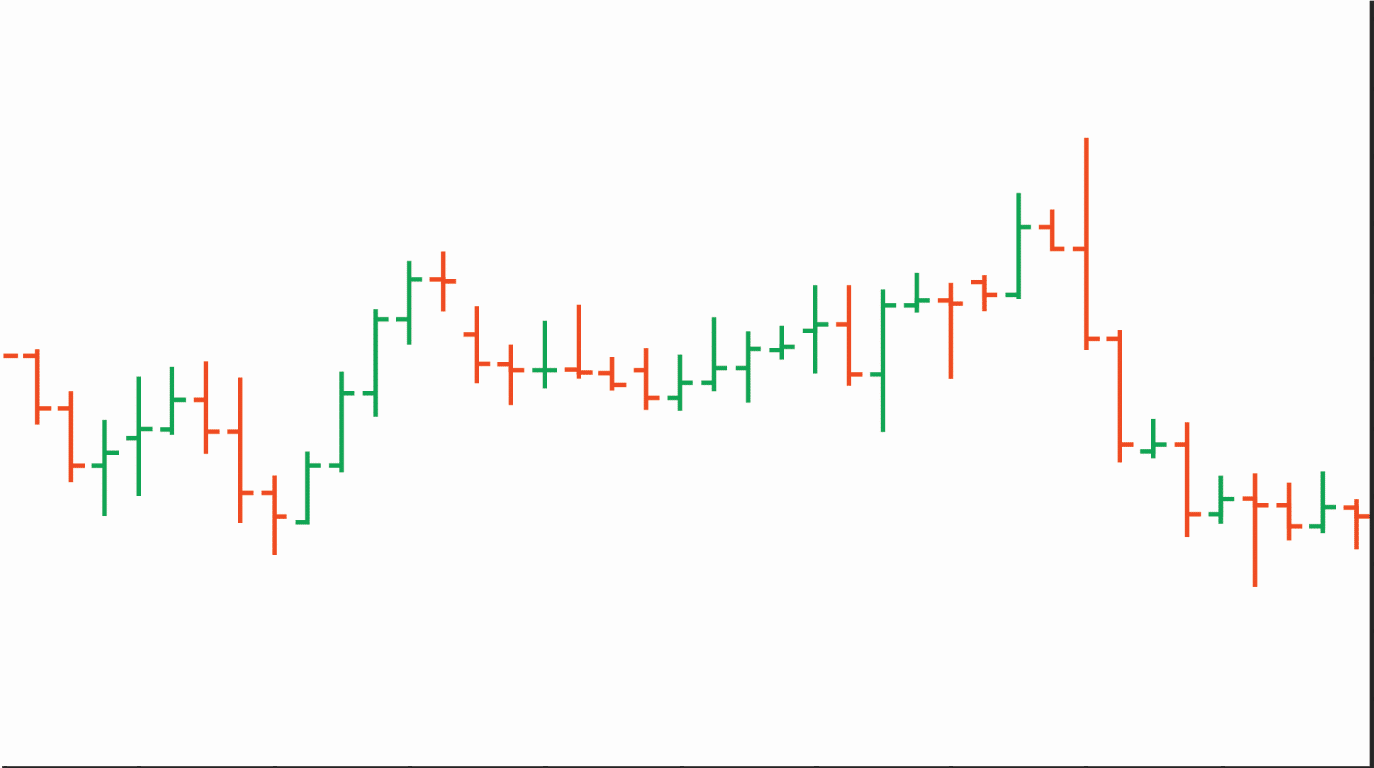
Both show open, high, low, and close prices. Candlestick charts use color coding for price bars and thicker real bodies. This visual approach helps traders quickly grasp the differences between open and closed prices.
A bar chart is a visual representation of an asset’s price movement over a specific time period. Here’s how it works:
- Each bar represents a trading day or another chosen time frame.
- The vertical line within the bar shows the high and low prices during that period.
- The left horizontal line indicates the opening price and the right horizontal line represents the closing price.
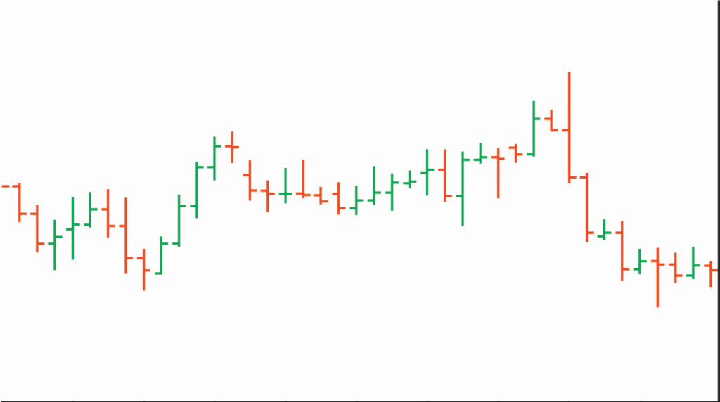
Pic Credit – sashares.co.za
Bars can be color-coded:
- Green: If the close is above the open (bullish).
- Red: If the close is below the open (bearish).
Long vertical bars represent high volatility, which is a bigger difference between high and low), whereas small vertical bars represent low volatility.
Remember, traders use bar charts to analyze trends, spot reversals, and monitor volatility.
What are Chart Patterns?
Let’s delve into chart patterns used in trading. Chart patterns are unique formations within a price chart that technical analysts use to identify potential trading opportunities. These macro patterns represent the price change of security through the hour, day, or month. They are a collection of candlesticks
Before starting we should understand some of the common terms used.
- Trendlines: These are straight lines drawn on a price chart by connecting a series of highs or lows. An upward trendline occurs when prices have higher highs and higher lows, while a downward trendline forms when prices have lower highs and lower lows. These are essential for identifying patterns. Trendlines help spot support and resistance areas on a price chart.
- Continuation Patterns: These patterns suggest that the existing trend will continue after a brief pause. Examples include flags, pennants, and rectangles.
- Reversal Patterns: These indicate a change in trend direction. Notable reversal patterns include head and shoulders, double tops/bottoms, and triangles.
- Fractal Nature: Patterns can be seen in any charting period (weekly, daily, minute, etc.) and are bounded by at least two trendlines.
- Pennants: These are small triangles that form after strong price movements
Remember, technical analysis patterns offer visual cues about market sentiment and potential price movements. Some of the famous technical patterns are discussed below:
Cup and Handle Pattern:
A rounded bottom followed by a consolidation (the handle). Bullish continuation pattern
The cup and handle pattern is a technical chart formation that often signals a bullish continuation. The cup resembles a “U” shape on the price chart. It typically follows a temporary price decline (like the bottom of a cup). The cup’s length can vary, but longer and more rounded bottoms provide stronger signals. Cups with a sharp “V” bottom need to be avoided.
After the cup, there’s a minor consolidation forming known as the handle. The handle has a slight downward drift. Ideally, the handle should form in the top half of the cup pattern. Deep handles should be avoided.
Volume should decrease as prices decline during the cup formation. When the stock begins to move higher (back up to test the previous high), volume should increase. A retest of previous resistance isn’t required, but the further the handle is from the highs, the more significant the breakout needs to be.
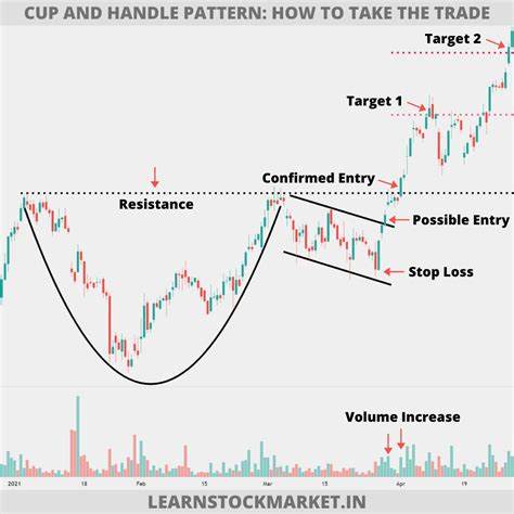
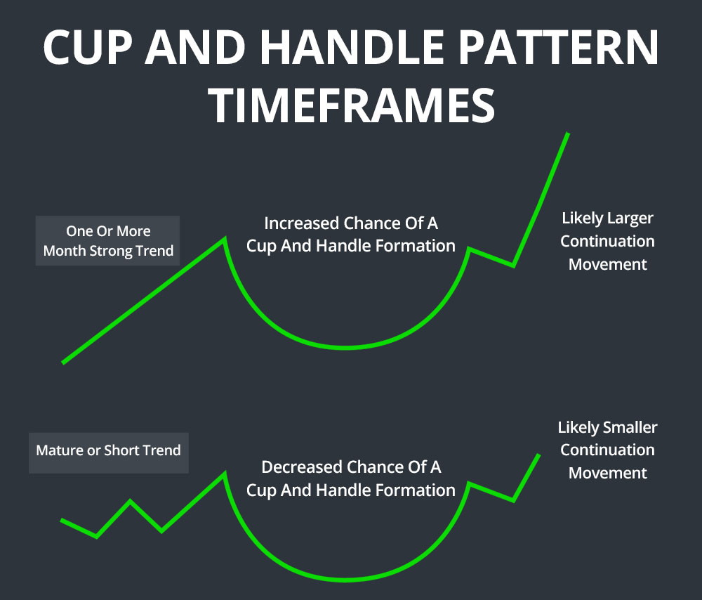
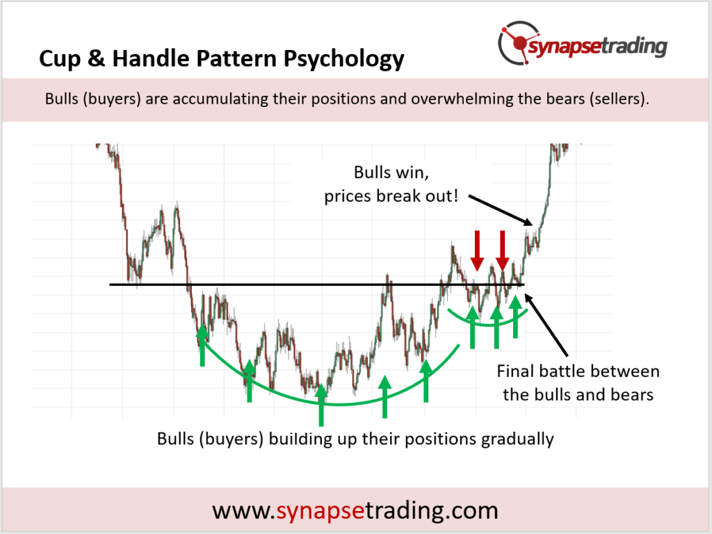
Remember, the cup and handle pattern is used to identify buying opportunities during an uptrend. Traders often place a stop-buy order slightly above the upper trendline of the handle.
Ascending Triangle:
The ascending triangle pattern is a bullish continuation chart pattern that often appears during an upward trend. Formed by converging trendlines with a flat top and rising bottom. It suggests a potential bullish breakout.
The pattern consists of a series of higher lows. There’s a horizontal resistance area formed by connecting the swing highs. The price action temporarily pauses the uptrend as buyers consolidate. It’s one of the most common chart patterns due to its simplicity (just two trend lines).
If the price breaks above the top of the pattern, traders can consider a long position. If the price breaks below the lower trendline, traders can consider a short position. Set a stop loss just outside the pattern on the opposite side from the breakout. Calculate a profit target by measuring the height of the triangle and adding it to the breakout point.
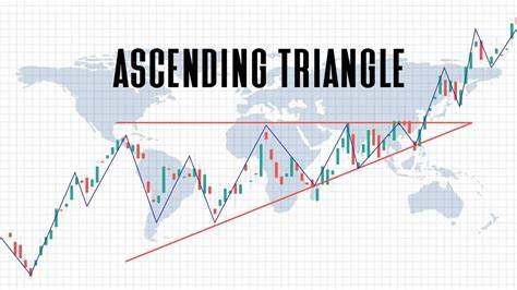
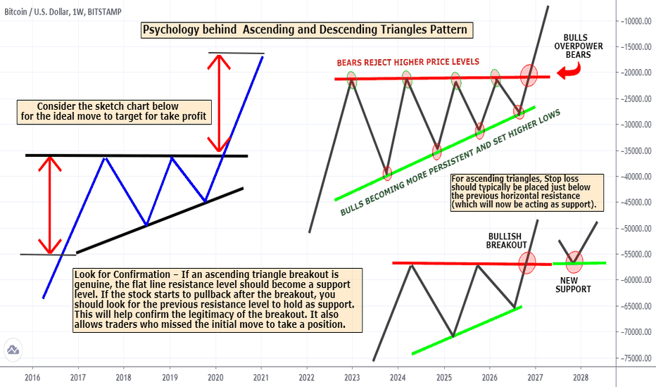
Remember, ascending triangles signal potential future price breakouts within an existing trend. Keep an eye on volume during the breakout, as increasing volume confirms the strength of the move.
Descending Triangle:
.Similar to the ascending triangle, but with a flat bottom and falling top. It indicates a potential bearish breakout.
A descending triangle consists of two key components:
- A descending upper trendline connecting lower highs on the price chart.
- A flat lower trendline which connects a series of lows.
It typically occurs during a downtrend. The descending triangle suggests that sellers are more aggressive than buyers. As the price keeps hitting lower highs, it indicates weakening demand. When the price breaks below the lower support (the flat trendline), it signals likely downward momentum continuation.
Traders often initiate short positions following a high volume breakdown from the lower trendline support. The price target for this pattern is usually equal to the entry price minus the vertical height between the two trendlines at the time of the breakdown. The upper trendline resistance serves as a stop-loss level to limit potential losses.
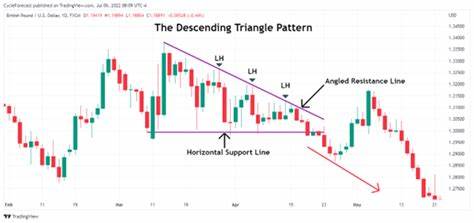
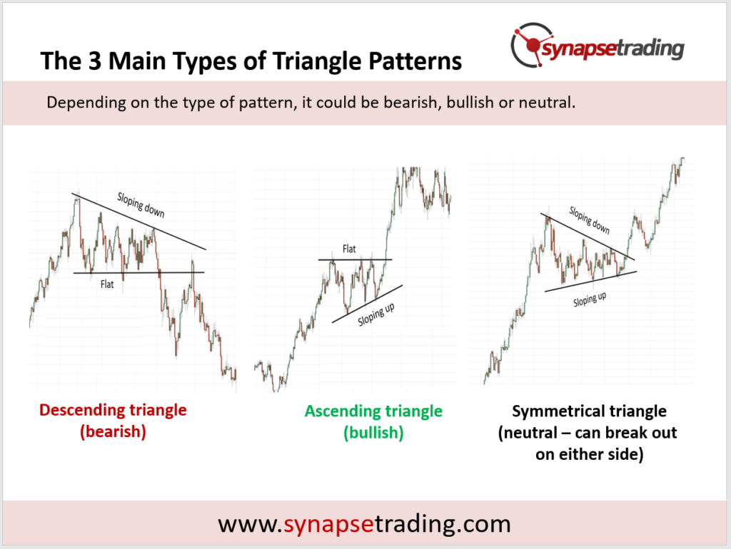
Remember, the descending triangle pattern can lead to substantial profits over a brief period if traded strategically.
Symmetrical Triangle:
The symmetrical triangle pattern is a commonly observed formation in technical analysis of financial markets. Created by converging trendlines with no clear bias. A breakout can occur in either direction.
A symmetrical triangle occurs when a security’s price consolidates, forming two converging trend lines. These trend lines have opposite slopes, creating a narrowing pattern that resembles a triangle. The converging lines represent a pause in the prevailing trend as bulls and bears reach an equilibrium.
Once the price breaks out decisively from the triangle, it often signals either the start of a new trend or the continuation of the prior trend. The breakout direction (above the upper trend line or below the lower trend line) reveals which side has gained the upper hand.
Traders closely watch symmetrical triangles for trading opportunities. The price target for a breakout or breakdown is equal to the distance between the initial high and low, applied to the breakout/breakdown point. Confirm this pattern with additional indicators.
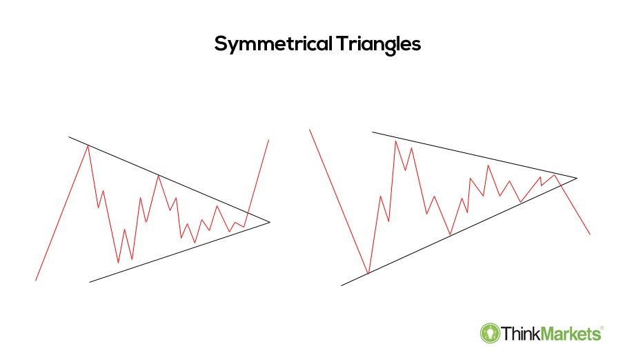
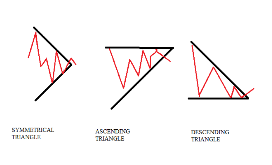
Remember, symmetrical triangles represent a balance between buyers and sellers, and their breakout can lead to significant price movements
Head and Shoulders:
It is a reversal pattern with three peaks (left shoulder, head, right shoulder). It signals a shift from bullish to bearish.
The head and shoulders pattern consists of three peaks:
- The left shoulder: A price rise followed by a peak and then a decline.
- The head: A subsequent price rise forming a higher peak.
- The right shoulder: Another decline followed by a rise, forming a peak lower than the head.
Apart from the above the neckline is crucial part of the pattern. It connects the troughs (for an inverse head and shoulders) or the peaks (for a regular head and shoulders). When the price breaks below the neckline, it confirms the reversal.
The opposite of the head and shoulders is the inverse head and shoulders (or head and shoulders bottom). It predicts reversals in downtrends. Price falls to a trough, rises, falls below the former trough, rises again, and then falls (but not as far as the second trough). The final trough leads to an upward move toward the resistance (the neckline).
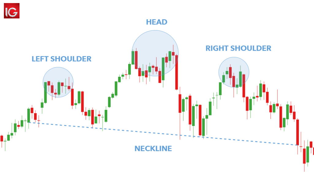
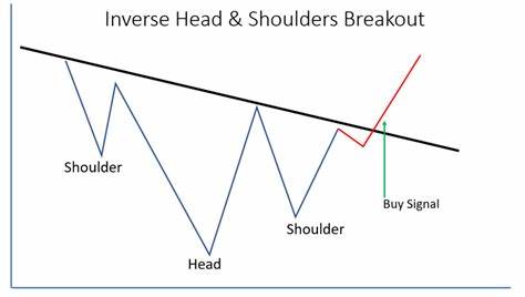
Remember, both patterns are reliable indicators, signaling potential trend reversals.
Double Top:
The double-top pattern is a bearish technical reversal formation used in trading. Two peaks (double top) or troughs (double bottom) signal a potential reversal.
A double top occurs when an asset reaches a high price twice consecutively with a moderate decline between the two highs. It is confirmed once the asset’s price falls below a support level equal to the low between the two prior highs.
It is characterized by the following:
- Two peaks: The pattern consists of two almost equal-sized peaks that are close in height.
- Trough: These peaks are separated by a trough.
- Resistance: The price reaches a resistance level twice but fails to break past it.
Traders often interpret the double top as a signal to sell or enter short positions. The neckline (support level) acts as a crucial reference point. While double tops are bearish, their profit potential may be limited.
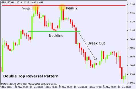
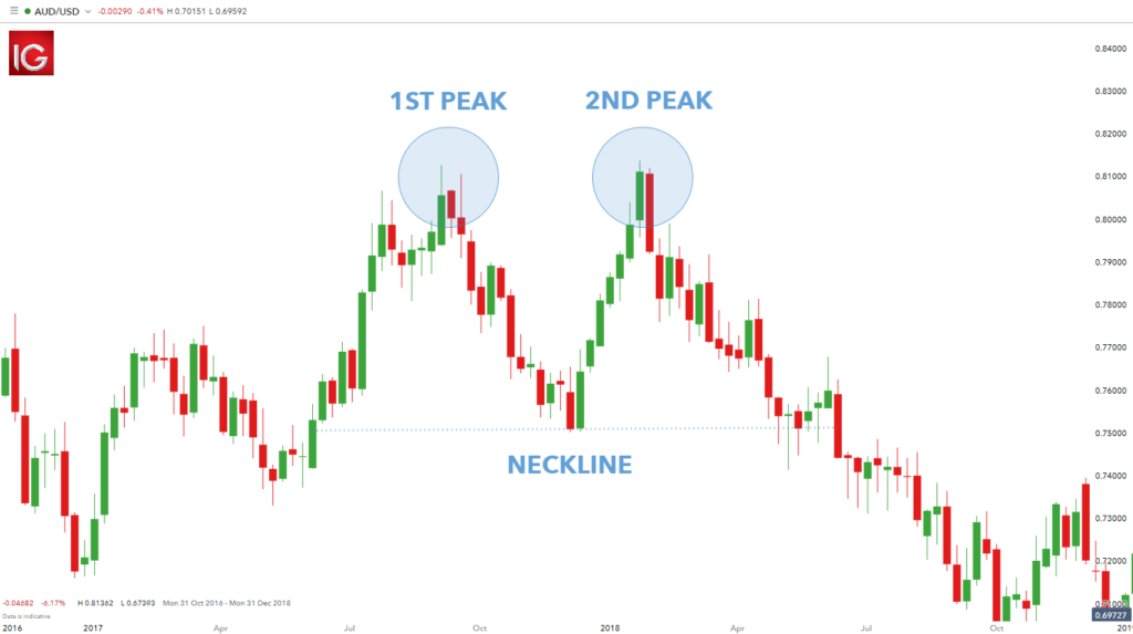
Remember, a double top signals a potential medium or long-term trend change in an asset class
Double Bottom:
The double bottom pattern is a classic chart formation used in technical analysis to identify potential trend reversals.
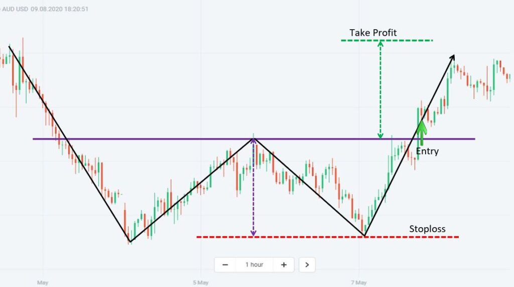
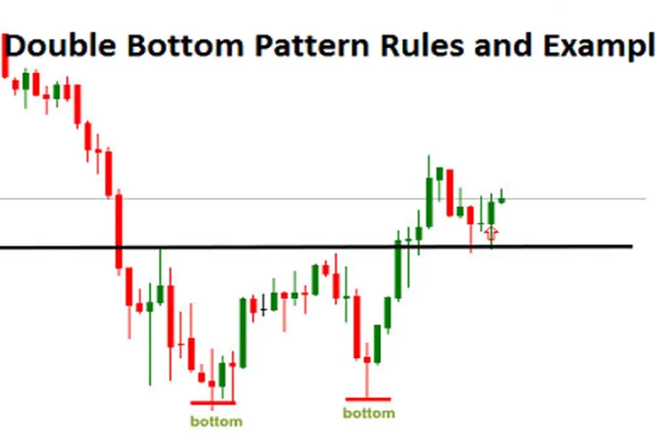
A double-bottom pattern is a bullish reversal pattern that typically occurs at the bottom of a downtrend. It signals that the sellers, who were in control of the price action, are losing momentum. The pattern resembles the letter “W” due to the two-touched lows and a change in trend direction from a downtrend to an uptrend.
The double-bottom pattern consists of three parts:
- First Low: After a strong downtrend, the market bounces higher, forming a swing low (the lowest price over a given time).
- Second Low: The price drops again to approximately the same level as the first drop.
- Rebound: Finally, the price rebounds and breaks through, signaling a bullish reversal after the bearish trend.
It suggests that the continuous downtrend has bottomed out. The price is likely to start increasing again, marking the beginning of a potential future uptrend. Remember, a double bottom is the opposite of a double top, which indicates a bullish-to-bearish trend reversal.
Flag and Pennant:
Short-term consolidation patterns. Flags are rectangular, while pennants are small symmetrical triangles. Both suggest continuation.
Pennants are Short-term consolidation patterns that resemble small symmetrical triangles. They suggest a continuation of the existing trend. Flags are Rectangular consolidation patterns that also indicate a continuation of the trend.
Flag Pattern:
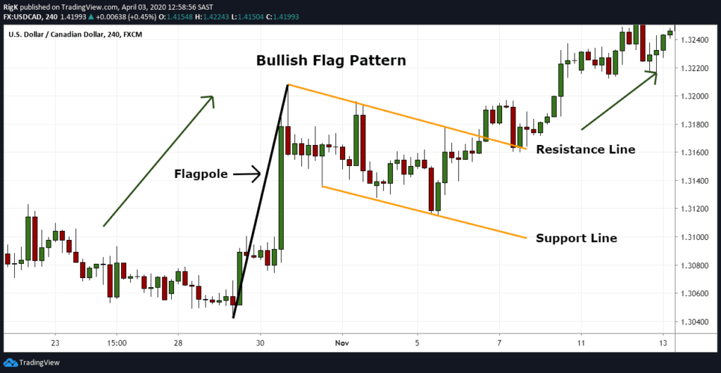
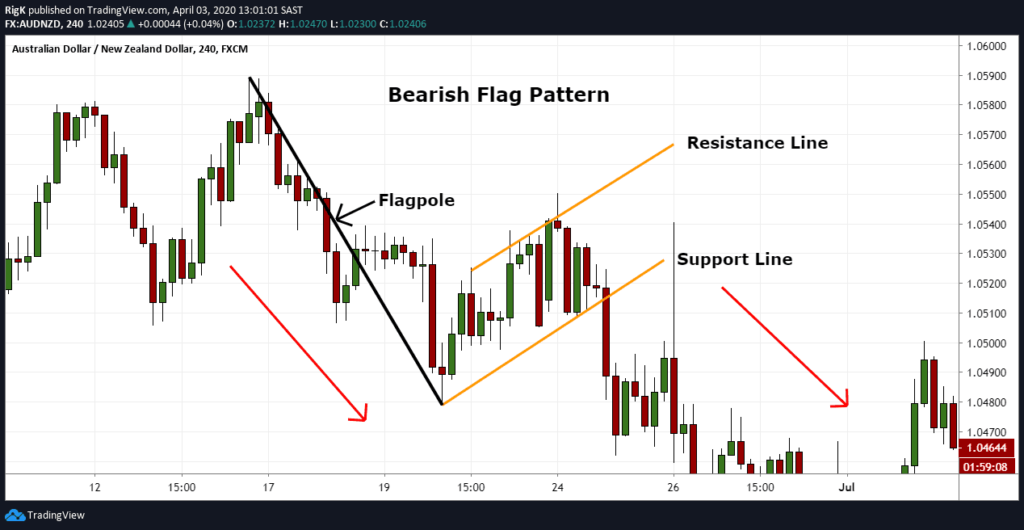
They are rectangular in shape and form after a sharp price movement (either up or down) and represent a brief consolidation before the previous trend resumes.
The key characteristics of Flag are as described below:
- Shape: The flag resembles a rectangular flag on a pole (hence the name).
- Duration: Flags typically last from one to three weeks.
- Volume: The initial move (flagpole) should have a high volume, while the consolidation phase should have a weaker volume.
Traders often enter new positions following a breakout from the flag pattern. Price targets are often determined by applying the height of the initial flagpole to the breakout point. Stop-loss levels are usually set at the lowest point of the pattern.
Pennant Pattern:
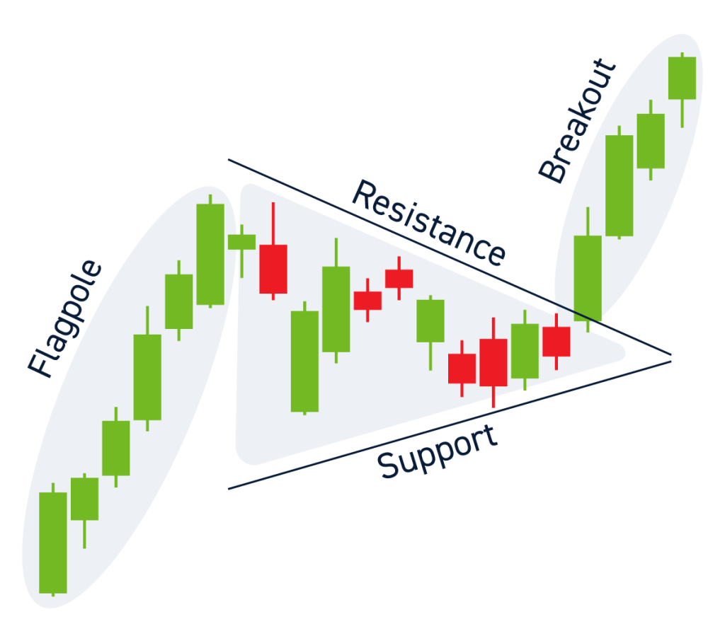
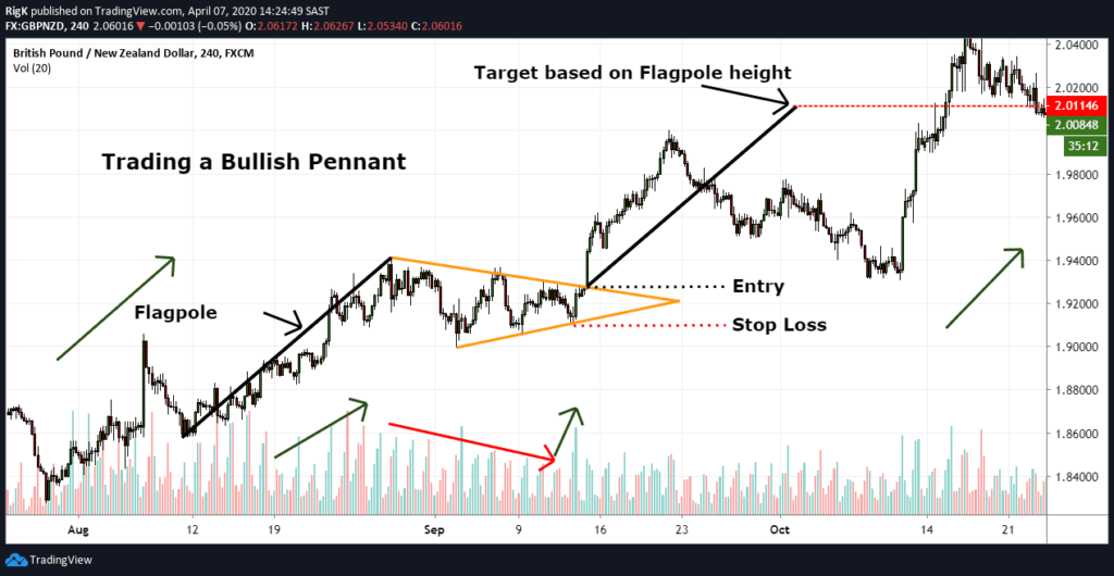
A pennant is also a continuation pattern, similar to a flag. It occurs after a large price movement (flagpole) followed by a consolidation period. The consolidation forms converging trend lines (like a symmetrical triangle).
Pennants last from one to three weeks. The initial move should have a large volume, while the pennant should have a weakening volume, followed by a volume surge during the breakout.
Traders look for breakouts from the upper trend line of the pennant. Price targets are often calculated using the flagpole’s height applied to the breakout point. Stop-loss levels are typically set at the lowest point of the pennant.
Double Support/ Resistance Pattern
In a downtrend, prices fall due to an excess of supply over demand. As prices decline, buyers become interested, and demand starts to match supply. Support is an area on a price chart where buyers are willing to step in, causing the price decline to halt and potentially reverse. It can be a specific price level or a broader price zone. Think of it as a floor that prevents prices from falling further.
In contrast, resistance occurs during an uptrend. Prices rise because demand exceeds supply. At a certain point, selling pressure overwhelms buying interest. Resistance is a level where supply begins to dominate, preventing further price increases. Like support, it can be a specific level or a broader zone.
The double bottom pattern is a bullish reversal pattern. It forms after a downtrend and consists of two equal lows (support levels) separated by a rebound. When prices reach the second support level, they may reverse upward. Conversely, the double-top pattern is its bearish counterpart. Both patterns provide potential entry or exit points for traders.
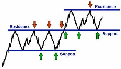
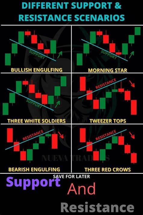
Remember, these levels are crucial for technical analysis, and traders often use them to make informed decisions.
This is all for this post. Let me know your thoughts in the comments section below. Don’t forget to follow my Facebook and Instagram pages for regular updates. See you all in the next post. Till then keep learning.
